Stochastic RSI (adjustable fast line color)Definition
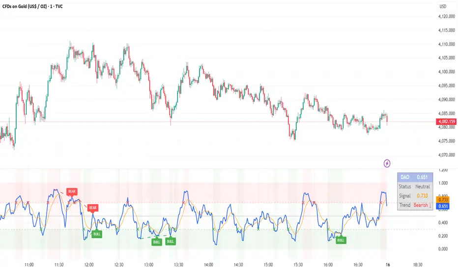
The Stochastic RSI indicator (Stoch RSI) is essentially an indicator of an indicator. It is used in technical analysis to provide a stochastic calculation to the RSI indicator. This means that it is a measure of RSI relative to its own high/low range over a user defined period of time. The Stochastic RSI is an oscillator that calculates a value between 0 and 1 which is then plotted as a line. This indicator is primarily used for identifying overbought and oversold conditions.
History
The Stochastic RSI (Stoch RSI) indicator was developed by Tushard Chande and Stanley Kroll. They introduced their indicator in their 1994 book The New Technical Trader.
Calculation
In this example, a very common 14 Period Stoch RSI is used.
Stoch RSI = (RSI - Lowest Low RSI) / (Highest High RSI - Lowest Low RSI)
Here are some approximate benchmark levels:
14 Day Stoch RSI = 1 when RSI is at its highest level in 14 Days.
14 Day Stoch RSI = .8 when RSI is near the high of its 14 Day high/low range.
14 Day Stoch RSI = .5 when RSI is in the middle of its 14 Day high/low range.
14 Day Stoch RSI = .2 when RSI is near the low of its 14 Day high/low range.
14 Day Stoch RSI = 0 when RSI is at its lowest level in 14 Days.
The basics
It is important to remember that the Stoch RSI is an indicator of an indicator making it two steps away from price. RSI is one step away from price and therefore a stochastic calculation of the RSI is two steps away. This is important because as with any indicator that is multiple steps away from price, Stoch RSI can have brief disconnects from actual price movement. That being said, as a range bound indicator, the Stoch RSI's primary function is identifying crossovers as well as overbought and oversold conditions.
What to look for
Overbought/Oversold
Overbought and Oversold conditions are traditionally different than the RSI. While RSI overbought and oversold conditions are traditionally set at 70 for overbought and 30 for oversold, Stoch RSI are typically .80 and .20 respectively. When using the Stoch RSI, overbought and oversold work best when trading along with the underlying trend.
During an uptrend, look for oversold conditions for points of entry.
During a downtrend, look for overbought conditions for points of entry.
Summary
When using Stoch RSI in technical analysis, a trader should be careful. By adding the Stochastic calculation to RSI, speed is greatly increased. This can generate many more signals and therefore more bad signals as well as the good ones. Stoch RSI needs to be combined with additional tools or indicators in order to be at its most effective. Using trend lines or basic chart pattern analysis can help to identify major, underlying trends and increase the Stoch RSI's accuracy. Using Stoch RSI to make trades that go against the underlying trend is a dangerous proposition.
Inputs
K
The time period to be used in calculating the %K. 3 is the default.
D
% D = Percent of Deviation between price and the average of previous prices (Momentum). The time period to be used in calculating the %D. 3 is the default.
RSI Length
The time period to be used in calculating the RSI
Stochastic Length
The time period to be used in calculating the Stochastic
RSI Source
Determines what data from each bar will be used in calculations. Close is the default.
Indicador Pine Script®